New Noble Collection HBP Items Including Slytherin’s Ring, Locket and More
Oct 12, 2008
Uncategorized
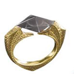
With the holidays right around the corner, the Noble Collection has revealed some of their new Harry Potter and the Half-Blood Prince products. Currently available only via SkyMall, new this year is the Slytherin Locket ($49 USD), “Dumbledore’s Marvolo Ring” ($49 USD), and Ron’s Heart Necklace ($79 USD). Also new are collector’s wall stands for wands of Harry, Hermione, and Voldemort ($29.90 USD each).
Thanks so much Sylvie!